Quilted Color Stories
When I worked at a local quilt shop I was amazed at how many folks really struggle with choosing color. It was the most often asked question we seemed to hear…What colors should I choose? To be honest, that answer is different for every single quilt ever made! Here are some things I think about when selecting a color story.
Who/what is the quilt intended to celebrate?
Does it need to match a color request? Is it for a holiday? Is it for someone special? This is the best place to start! This will narrow things down quite a bit!
How do I want it to feel?
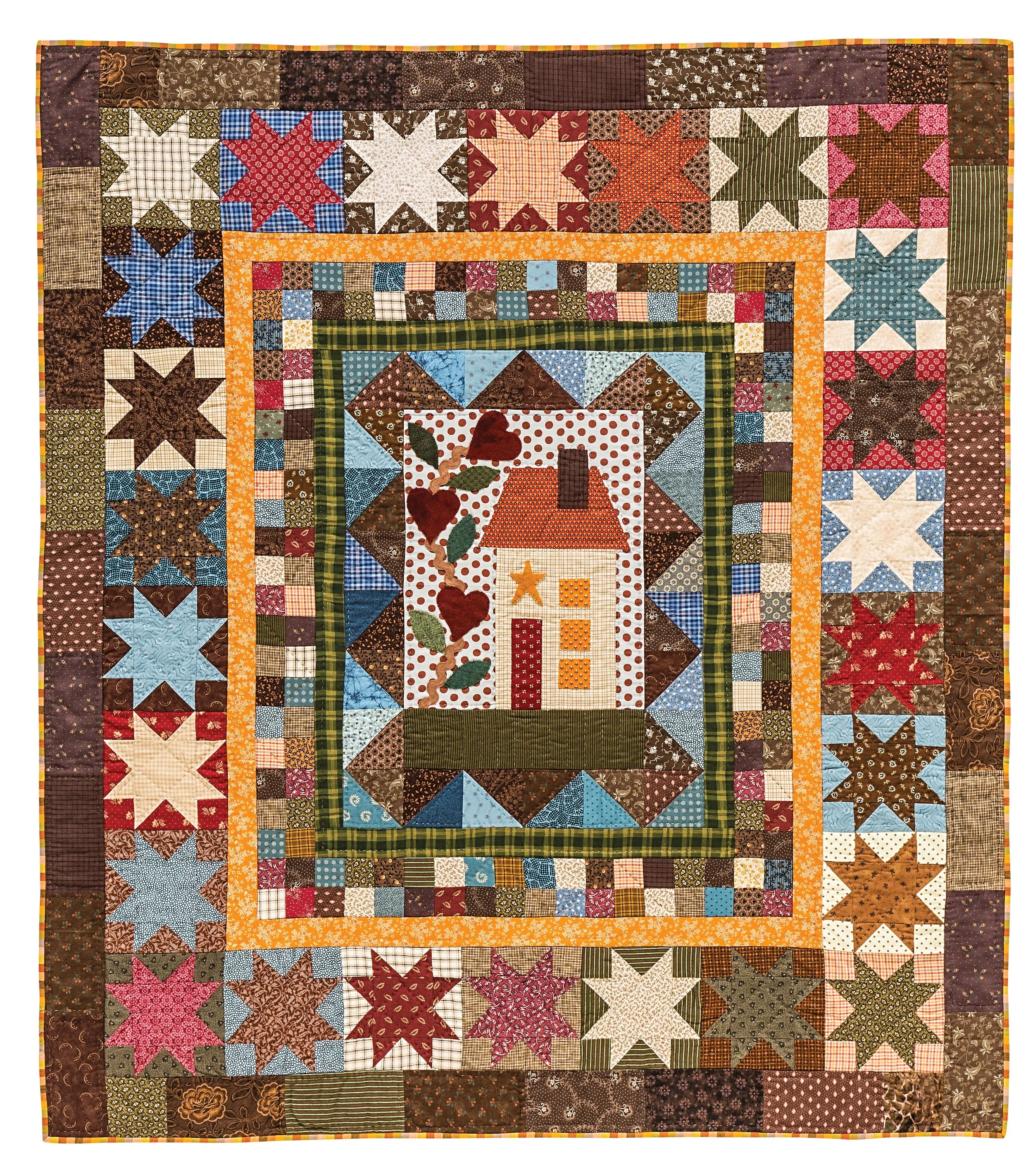
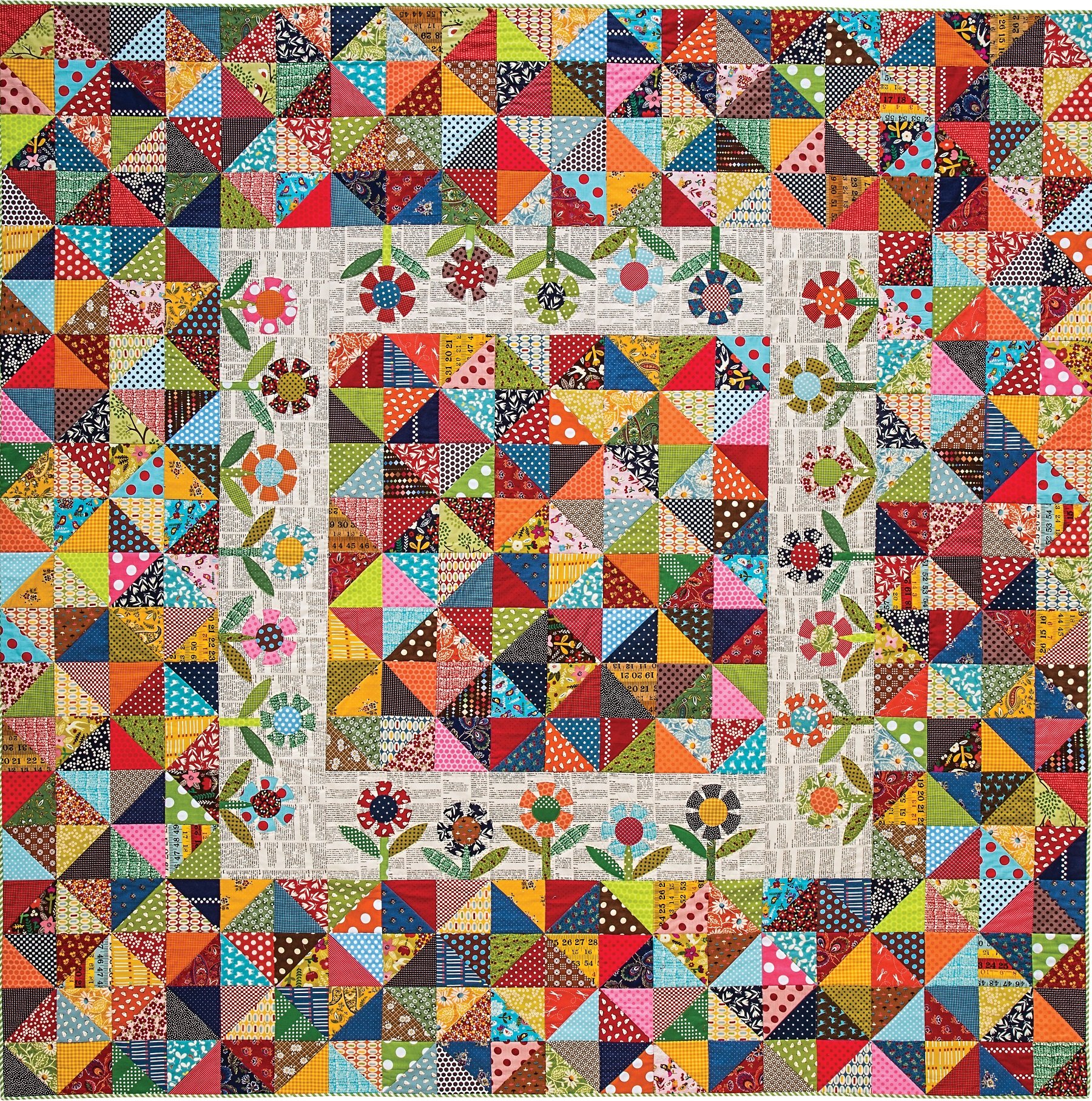
Bright combinations are great for children, cheerful celebrations, young people, anyone who has a bold personality! Toned down colors are good for creating a vintage feel, something soft and encouraging, perhaps a recovery or ‘get well’ or more serious occasion. Plaids, stripes and geometric prints can help a quilt feel more masculine or ‘outdoorsy’ in almost any color. Florals are good for sweet sentiments and woodland colors are great for camping and celebrating nature.
What if I don’t have any specific plans for the quilt?
Go to the hardware store and pick up paint swatches. They often have books that have color combinations. Flip through quilting magazines and look for a combination that appeals to you. Go online and find lots of tools for creating a color story from a favorite photo!
Why not let your favorite fabric decide?
Have you ever fallen in love with a fabric and didn’t know why? It’s probably the color combination. Now go collect fabrics in every color that appears in the favorite fabric. Then add lights/mediums/darks of each of those colors.
What if it’s not a perfect match?
There is safety in numbers. If you choose 5 fabrics for a quilt and one is ‘off’ it can really hurt the overall design, but if you choose 50 fabrics, you won’t even notice! Not sure which red fabric to add? Add a dozen different shades and they all sparkle!
Why are my quilts not as exciting as I want them to be?
Almost every time, the answer is because it was played too safe. If every blue fabric matches perfectly in the quilt, you could have just used one and gotten the same effect? But if you add 20 shades of blue, then they make each other shine!
What can I do to make my colors more interesting?
Choose fabrics that are small scale, large scale, open prints (lots of background) and tight prints (very little background). Also add some dots and stripes to for punch. I always mix reproductions with batiks and holiday fabrics. The only rules that apply are the ones you choose! If you are scared of mixing prints and styles, lay them out together and snap a photo on your phone. The photo will show which one sticks out, or what needs more company. Let the prints create variety as much as the color.
Let each quilt teach you something about what you love…
Each quilt you make can teach you a lesson. They don’t all have to be the same to be amazing, but ask yourself, what’s my favorite thing about this quilt? Then add that to the next quilt. Repeat. See how that works? Before you know it, you will be including so many things that are your ‘favorites’ that you will fall in love with each quilt a little bit more!
Enjoy every stitch! Diane


